University Heraldry of the United Kingdom — a Graphic Design Critique
Heraldry was the graphic design of the Middle Ages, it is entrenched (in the British tradition at least) in a peculiar dialect of Norman French, dictating how the colours, charges, and supporters are to be laid out. Its rules have to an extent, however, echoed through the ages. The ‘Rule of Tincture’ — that no colour can touch another colour, and that no ‘metal’ (white and yellow) can touch another metal — allows any coat of arms to be simply and effectively reduced into black and white, and the very nature of the art — as a realisation of a definition more than a copy of an older design — means that heraldry has a timeless appeal in its versatility.
A great many institutions across the United Kingdom utilise heraldry, from the modern logos of the royal family and the Government all the way down to the arms on the door of every Tesco lorry (seriously). Heraldry suggests a certain gravitas and importance in an institution, and so it is understandable that many schools and universities choose to use arms.
As I’m currently entering my final year of secondary education in the UK, the daunting task of narrowing down my university choices awaits me, and so I’ve been faced with a fair amount of university logos on my screens. Of the nearly 150 universities in the UK, only about 60 of them use heraldic logos. Of those, I have noted five major trends in displaying university arms.
- Full Colour Arms

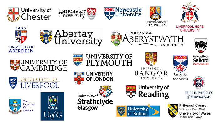
By far the most popular method of displaying university arms is a full colour image of shield placed next to the name of the university. This has been done very successfully in most cases, including some very clean designs (the simplification on the Lancaster and Newcastle arms is impressive). In comparison to the institutions’ actual arms, however, many of these fall short. A fair number of these universities have been granted crests and even supporters, as well as shields, yet only Liverpool Hope has presented any of these. This is understandable, when dealing with arms in their full colours already, adding in supporters or crests could overly complicate a logo. However a few universities on this list have rather unique arms, which deserve to be portrayed with more than just a shield.
The University of Aberdeen, for example, bears the crest of a crowned tower, atop a Scottish helm. While their current logo is smart and clean (as the vast majority of university logos in this tradition are), it would be interesting for some of them to incorporate other aspects of their armorial bearings. Often in the case of university arms, the shield will represent location and the main philanthropists who paid for the establishment of the university, and so the crest often brings in something more individual to the university itself, and it would be nice to see more crests in university logos.
2. Simplified Arms

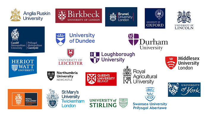
The next common way to present university arms — and in my opinion the smartest — is to simplify them into one or two colours. This is the approach taken by many armigerous organisations, governments, and councils, and can produce some really nice results. The challenge is to strike a balance between keeping the design simple, without losing the symbolism of the arms.
Anglia Ruskin and Lincoln have presented fairly similar arms in a very different style, however both work effectively and lose very little of the symbolism (in Lincoln’s case none at all). Cardiff Metropolitan, Brunel, Royal Holloway, and St. Mary’s have taken the approach of including mantling and all. Most have still gone with a simple shield, presented in differing degrees of simplicity — Swansea has simplified the shield itself almost out of existence.
The most impressive examples are those which have managed to cut the balance of simple design and including the often complex charges of heraldry. The University of Stirling has done a sterling job of it, as has Heriot Watt, though theirs begins to look messy at a distance. Of course the process of simplification is easier for those universities with easier arms, Durham and Dundee particularly, and those logos work well. It’s clear to see why some universities choose to simplify some aspects of even their shield out of existence, and so we come onto:
3. Modified Arms

Universities whose logos incorporate modified arms are a mixed bag. I haven’t included the original arms, but I shall link them for any of the logos above I discuss in particular. Some of these logos (and most of them would be considered heraldic inspired logos not arms) for me bring out a central problem in creating heraldic logos — keeping the rich symbolism of arms without verging away from them too far.
A prime example of this is the logo used by the University of Bristol. Every aspect of their arms are displayed in this logo. The two animals and the sun all reference benefactors of the university in its early days, the central device bears the arms of Bristol City Council, and the book beneath is for learning (naturally). These are all surmounted upon a red cross and a white field, on the original arms. In their logo, the university have managed to incorporate the animals, the sun, the city council, the cross, and the entire logo is presented in the shape of the book. It has successfully changed the heraldry into a logo. However in doing so it has appeared to create a new coat of arms, divided into quarters and bearing the devices and charges in a different order to the original arms.
The University of Bradford, and Chichester, have both done similar things, though Bradford’s is more obviously a logo. Chichester in particular has acted oddly, spreading their charges out across a quartered shield, and also bringing the helm which ought to be above it into the shield. The whole design feels like a strange choice.
The University of East London has a wonderful coat of arms, and in the same style could have emblazoned them properly, which would have looked very good, however have chosen to take a mash of parts from their arms and put them together for aesthetics over heraldry. Both universities in Buckinghamshire have strangely mixed their arms up, Buckingham taking the crest and the lower third of their shield, and the New University creating a completely different shield with the charges, in a very nice style which could easily have been applied to their actual arms.
None of the logos here are in a style which couldn’t easily be turned to emblazoning the university’s actual arms, instead of implying a different armorial bearing, and so it is a shame in some cases that they haven’t done that. Others, such as Bristol and Bradford, aren’t that obviously coats of arms and so have at least taken inspiration from their arms, and not mashed them too much.
4. Aspects

A few universities have chosen to take aspects of their arms, usually a charge (in the case of Bath), the crest (Surrey and Birmingham City) or the supporters (De Montfort and Anglia Ruskin). These are nice logos, and it’s particularly good that they have chosen to use an aspect of their arms instead of something more generic. It would be nice to see their full arms in the same style, perhaps, as a larger scale logo. Surrey’s crest in particular looks very clean, and the line design used by Anglia Ruskin would be interesting to see working with the shield and mantling (though Anglia Ruskin have a different variant of their logo using their full arms.)
From both a heraldic and a graphic perspective these are good logos. It’s not uncommon in heraldry for just the crest to be used to represent a person or institution — what Surrey has done is in a way little different to what the universities using just their shields have done.
5. Oddities

These remaining arms are a strange selection, and all bear different problems. I assumed that the Open University and Nottingham Trent University were not armigerous, however Nottingham Trent bears a perfectly good coat of arms, and it baffles me as to why they have chosen to instead have a shield containing lettering. The Open University evidently utilised their logo before their arms were granted, and so they are technically using their crest here, though their crest is vaguely shield shaped so I thought it worth including. Harper Adams University has a coat of arms, but has made the truly bizarre decision to instead put a vectorised corner of their mantling on a shield, and a letter H — why they haven’t used their arms is beyond me.
AECC University College and Queen Mary University do not appear to be armigerous. I may be wrong here, however I couldn’t seem to find any other variants of their arms, or any reference to them elsewhere. Feel free to correct me on this. AECC has designed an odd logo which feels like an attempt to be like a coat of arms, particularly the unnecessary quartering and the ‘AECC’ written in the first quarter. Queen Margaret, on the other hand, has produced a genuinely good coat of arms (which they refer to as a ‘logo’ throughout their page on it), with every part thought through to reference the institution or Queen Margaret of Scotland. It’s a well done coat of arms, and a well made logo.
To conclude, the United Kingdom’s university armorial scene is a varied one. However what I did not include was that a fair few universities in the first category also have a two-colour variant which might fit into the second category, which in my opinion is the best way to go with heraldic logos. Heraldry is a conveniently lenient and variable artform, and so if a logo is based around it, it can be changed around a fair amount without breaking any heraldic rules. This can of course go too far, as a few in the third category demonstrated, but on the whole this analysis of the UK’s university logos has shown that there are a great many ways to emblazon a coat of arms, and that heraldry is far from, as the English poet Thomas Gray remarked in the 18th century, a mere “boast of… pomp and pow’r.”
